All you need to know about home screen redesign in iOS 14
Apple has announced a completely redesigned home screen in the new iOS 14 operating system that it unveiled at the WWDC 2020 conference, where you will have customization tools that you can use to organize your iPhone screen, making it easier for you to access applications.
Here’s all you need to know about redesigning the main screen in the new iOS 14 system from Apple:
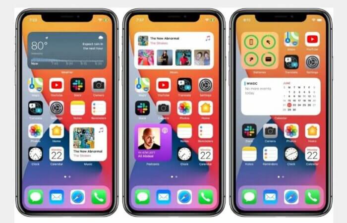
At first glance, we will find that (iOS 14) will bring a new way to reorganize your apps to access them quickly, in addition to the ability to place tools of multiple sizes all over the screen, where you can hide entire pages from the application icons that you do not use but you do not want to delete.
But what you will get, in fact, is not a redesign of the screen at all, but only a little flexibility to organize the home screen, which is optional depending on your preferences and desire, and then if you do not use it your experience of your phone will never change.
When the public beta of iOS 14 comes in July, and the final in the fall, you will actually see the same home screen layout that you are now using in iOS 13 with a network of icons spanning multiple screens.
In the operating system version (iOS 14), you will have many new options, where you will be able to add tools to the home screen if you wish, choose their sizes and position, and you want to use the new feature called (Smart Stack) to include a variety of elements That changes automatically based on the hours of the day and your usual activity.
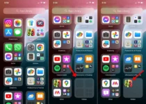
Additionally, you can view multiple pages of applications that you do not use, or hide them without permanently deleting them.

You will also see in (iOS 14) a new feature called (App Library) to keep tabs in all your applications by organizing them in huge squares on the main screen. You can access the app by swiping to the right side of the home screen until you reach the application library.
It is worth noting that the device screen organizing tools in (iOS 14) use artificial intelligence technologies, where you will have the latest applications added at the top of the screen, in addition to the folders in which the applications were organized by type.
You can also scroll vertically to find the application icon you want, or type the name of the application in the search field, or scroll alphabetically by application name, and if you do not want to use this method to organize your applications on the home screen you can keep the layout of your old screen itself unchanged.
The same applies to Widgets, as iOS 14 will give you the same layout that you have today by default, but you will have the option to add widgets to the home screen yourself and rearrange them by dragging and dropping.
